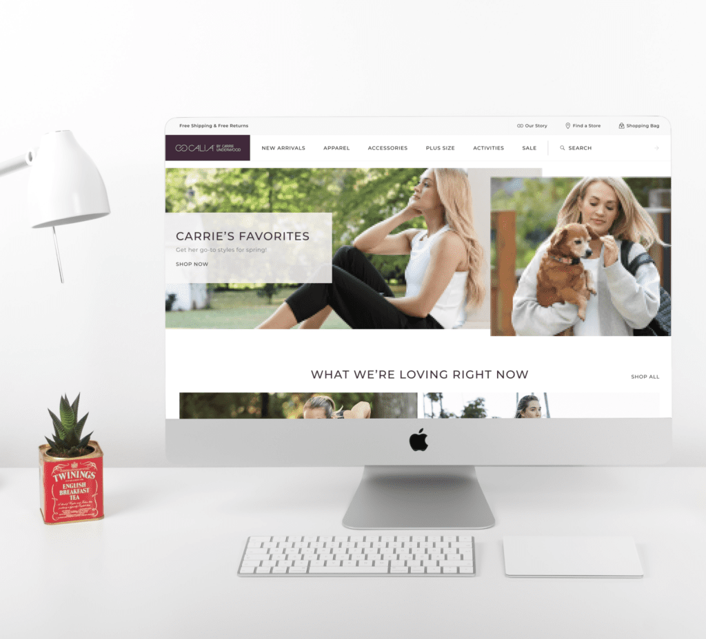
The journey towards revamping CALIA by Carrie Underwood’s online presence was driven by a commitment to enhancing user experiences and refining e-commerce functionality. The project aimed to deliver a seamless shopping experience that resonated with CALIA’s mission of inspiring women to embrace their health and fitness journey.
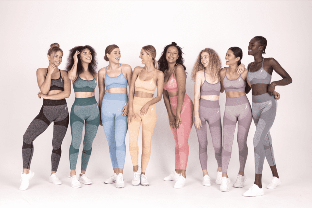
The primary goal was to transition away from a third-party hosting platform to an intuitive, in-house solution, coinciding with CALIA’s fifth anniversary. A new chapter for CALIA meant a fresh, user-centered design approach that embraced expanded product lines, including a dedicated plus-size collection.


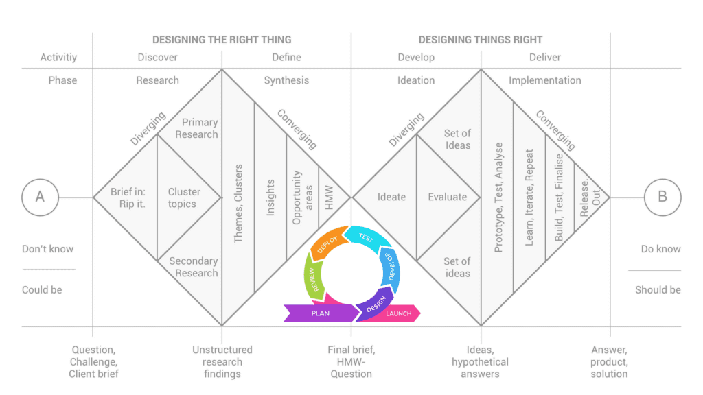
The implementations of agile methodologies and the double diamond, rapidly iterating on the designs while incorporating user feedback and leveraging data to inform decisions, were critical to this project.

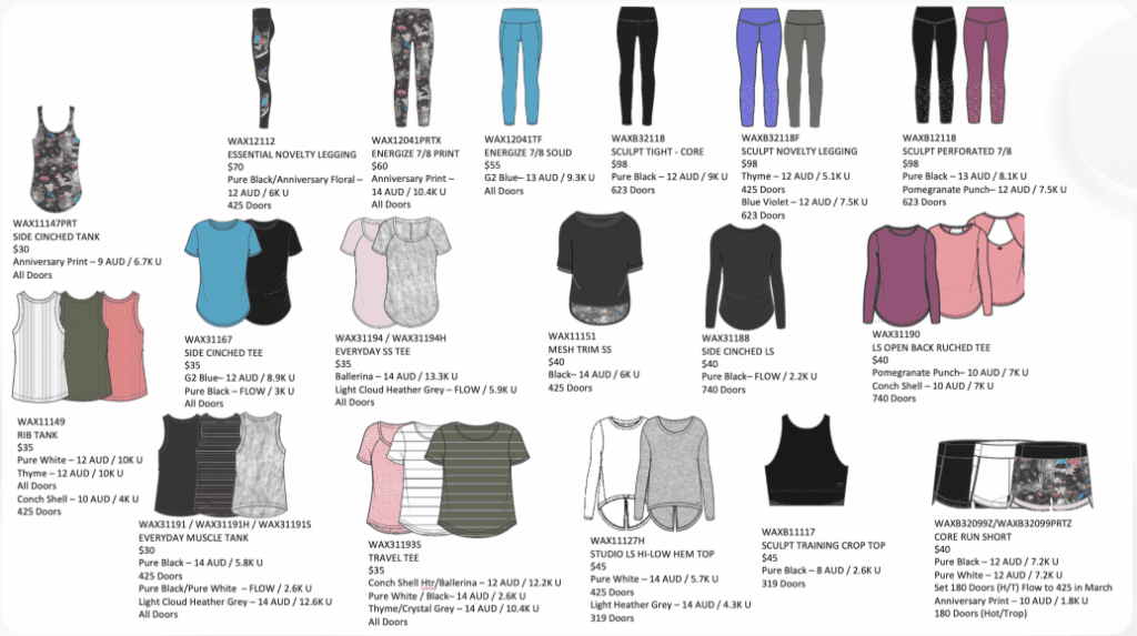
A preliminary analysis was carried out, engaging company stakeholders to acquire existing data, and to collect insights on upcoming merchandise. Additionally, the assessment included an examination of market trends and an analysis of the most searched SEO terms by women interested in plus-size activewear.

Targeted surveys were deployed to gain insights into customer preferences and to define the shopping behavior for athletic apparel.

A card sorting exercise was conducted with users to determine intuitive categorization, guiding the development of the new site structure and its Product Listing Page (PLP) and Search Results Landing Page (SRLP).
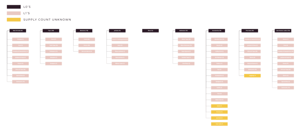

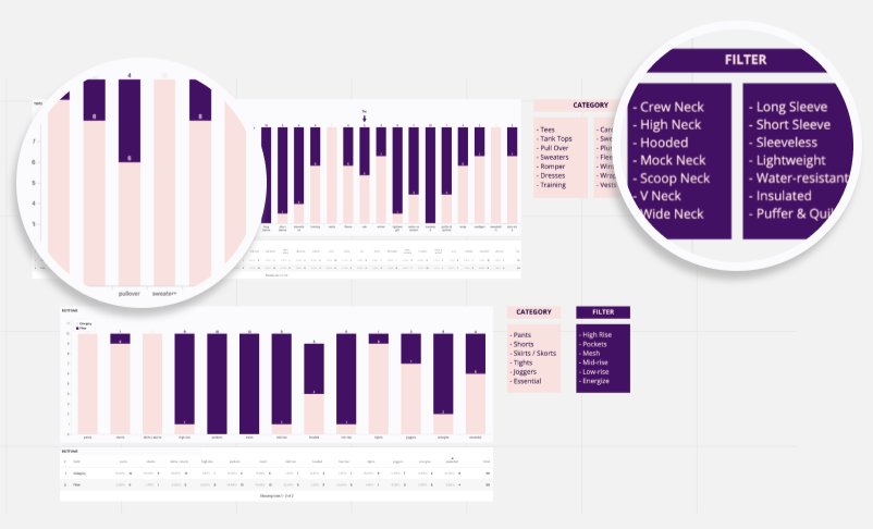
Surveys helped refine the language used on the site, distinguishing between category names and filter options for an improved navigation experience. This helped in deciding what terms belonged on the site’s taxonomy versus which terms were best used as filters within the PLP and SRLP pages.

Research data led to a user-focused taxonomy, carefully considering terms and categories such as ‘Plus Size.’
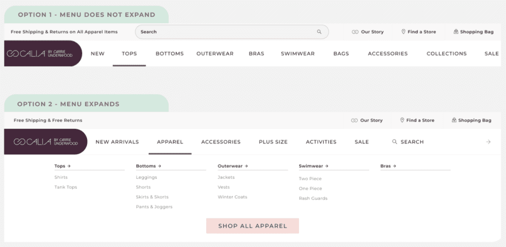

Prototyping helped explore various navigational structures, aiming for the most user-friendly interface for both desktop and mobile.


Interactive prototypes underwent usability testing to identify the most intuitive navigation system, considering both desktop and mobile responsiveness.


The approach to UI/UX was rooted in innovation, capturing the brand’s essence through every click and scroll. New components like interactive product showcases and storytelling elements were meticulously added to serve the narrative and simplify the user journey, with the aim to design a site that reflects users’ needs and desires.
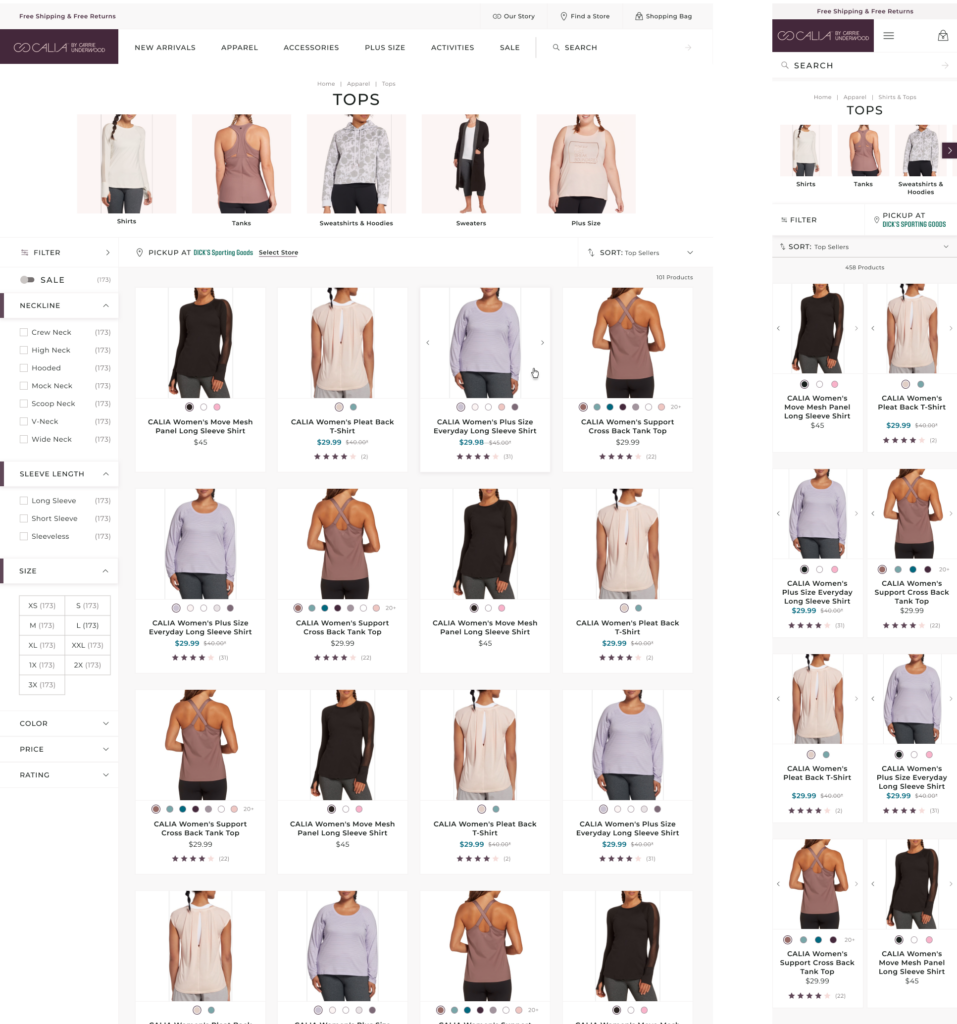

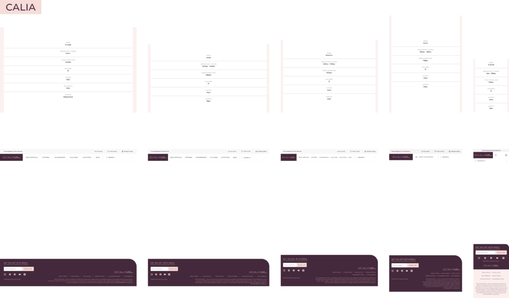
Transitioning from low to high-fidelity designs focused on crafting an intuitive interface that brought the brand story to life. Detail-oriented choices in typography, spacing, and responsive layouts resulted in a seamless experience across devices, showcasing a relentless pursuit of design excellence.
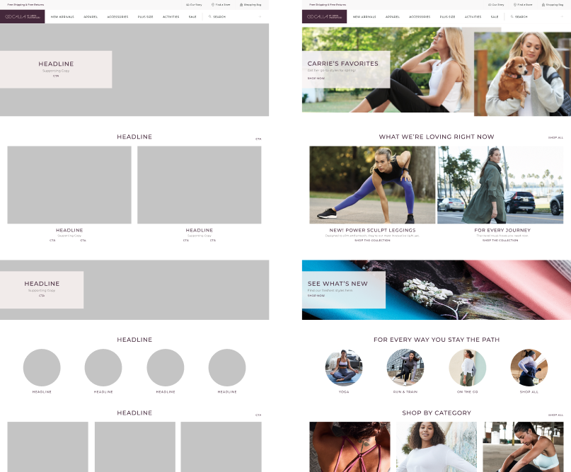

Adapting to a mobile-first world, the responsive design strategy ensures a consistent and exceptional user experience across devices. The use of the latest front-end technologies guaranteed designs that were not only visually compelling on any screen size but also quick to load, enhancing user engagement and satisfaction.

Post-launch metrics indicated a successful redesign with notable improvements:
The project demonstrated the significance of user-centered design, highlighting the ability to lead and implement changes that positively affected the business’ performance.


The redesigned website has established a new benchmark for the fitness apparel online shopping experience, with plans for ongoing enhancements based on user engagement data.

With a proven track record of boosting engagement and conversions, I deliver user experiences that not only resonate with customers but also drive substantial business growth. Let’s create compelling, user-first designs that elevate your company’s bottom line.