Case Study

Reducing Add-to-Order Friction
Through Research-Led IA

GetGo by Giant Eagle · UX Researcher & Designer

Role UX Researcher & Designer
Domain Mobile IA · Convenience Retail
Platform Mobile App
Methods Tree Testing · A/B Validation · Competitive Analysis
43%
Add-to-Order Friction Reduced
29%
Order Efficiency Improved
419→205
Menu Lines Condensed
7→4
Navigation Levels Reduced

The Problem

A bloated menu was costing orders.

GetGo's mobile ordering menu had grown without a clear structure. Users had to navigate up to 7 levels deep just to add a single item to their cart. With each level requiring a separate tap and each tap adding 3 to 5 seconds due to app load times, the friction compounded fast. Some items required up to 8 clicks just to reach the add-to-order screen.

The menu also exposed 419 separate lines. Not because GetGo had 419 products, but because size variants, build options, and customizations were surfaced as individual rows instead of being consolidated within item detail pages. The result was a menu that felt twice as large as it needed to be.
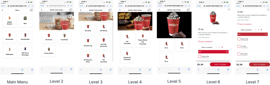
GetGo mobile app showing 7 levels of navigation required to add a hot chocolate to order

Current state: 7 navigation levels to add one item to order

Competitive Analysis

The competition was doing it in 2 clicks.

I audited McDonald's and Taco Bell mobile ordering flows to establish a benchmark for click depth and add-to-order efficiency before defining a target for the redesign.
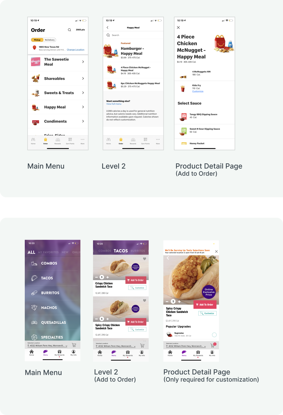
Competitive analysis showing McDonald's 3-click and Taco Bell 2-click menu flows compared to GetGo's 8-click flow
GetGo (Current State)
Up to 8 clicks to add to order
7 navigation levels. Each click adds approximately 3 to 5 seconds of load time. Price and add-to-cart action not visible until the final level.
McDonald's
3 clicks to add to order
Main Menu to Level 2 to Product Detail Page. Price and customization options visible at the product detail stage.
Taco Bell
2 clicks to add to order
Main Menu to Level 2, which includes price and Add to Cart inline. Product detail page only required for customization.

Both competitors surface price and an add action within 2 to 3 taps. GetGo required up to 8. That gap defined the redesign target.

Research and Findings

Tree testing revealed where users got lost.

I conducted tree testing and usability research to identify where the taxonomy was breaking down. Users consistently struggled to find items because the category structure did not match how they think about food.

Finding 1. Depth was the biggest driver of abandonment
Users dropped off most often at level 4 and beyond. The deeper the menu went, the higher the abandonment rate.
Finding 2. Category names created confusion
Labels like "GetGo Cafe Order" were internal naming conventions, not user language. McDonald's and Taco Bell used plain terms like Breakfast, Burgers, and Tacos. Users had no trouble navigating those.
Finding 3. Exposed variants inflated perceived menu size
Items like half sub and whole sub appearing as separate rows made the menu feel far larger than it was. These belonged inside a single item detail page as selectable options, not as top-level rows.

The Redesign

From 7 levels to 4. From 419 lines to 205.

The restructured taxonomy reduced navigation depth from 7 levels to 4 and cut exposed menu lines from 419 to 205. These were not arbitrary cuts. Every change was grounded in the research.

Reducing lines did not mean removing products. It meant moving size variants, build options, and sub-type choices out of the top-level menu and into item detail pages where they belong.

Lines of Items Compared

419
Current Menu
205
Proposed Menu

51% reduction in exposed menu lines

Hierarchy Reduction
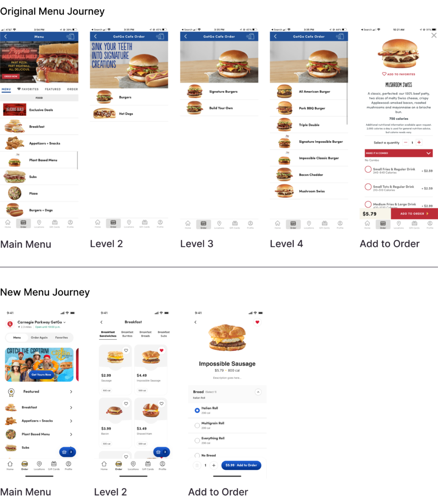
7 navigation levels collapsed to 4. Users can reach an add-to-order action in 2 to 3 taps instead of up to 8.
Line Consolidation
419 exposed lines reduced to 205. Variants and options moved inside item detail pages. The visible menu length was cut roughly in half without removing a single product.
Item Title Consistency
"Build Your Own" appeared written out in some places and abbreviated as BYO in others. One convention was standardized throughout. Titles that repeated category information were also shortened. For example, "BBQ Grilled Chicken Club Sandwich" became "BBQ Club" because the item already appeared under the Grilled Chicken Sandwiches category, making the repeated words unnecessary.
Side-by-side comparison of GetGo menu navigation before and after the IA redesign

Before and after: proposed menu required 2 to 3 taps vs the original 5 to 8

A/B Validation

The redesign was tested before it was shipped.

The proposed taxonomy was validated against the original using A/B testing to confirm the restructured hierarchy performed better before full implementation was recommended.

43%
Reduction in add-to-order friction
Users completed find-an-item tasks faster with fewer wrong turns on the proposed menu
29%
Improvement in order efficiency
The reduction in navigation levels directly translated to fewer taps and faster order completion

Reflection

What this project delivered.

Research First, Always
Tree testing made every taxonomy decision defensible. The IA changes were not opinions. They were validated against real user behavior before any visual design work was done.
Structural Simplicity Compounds
Removing one navigation level does not just save one tap. With app load time factored in at 3 to 5 seconds per click, each level removed saved real time per user per visit. At scale, that compounds into a measurable reduction in order drop-off.

A menu that makes users think is a menu that loses orders. The goal was not to make it prettier. It was to make it faster to use.

— Stephanie Gross, UX Researcher & Designer

Next Case Study →
Payout POS · Designing the End-to-End Onboarding Experience