The Problem
A Binder Can't Get a Software Update
Store employees at Dick's Sporting Goods determined which security tag to use — and where to place it — by flipping through a physical binder called the MES (Merchandise Exposure Standards). When corporate updated the standards, those updates traveled slowly through store managers, printed on paper, inserted into binders that may or may not have been current.
The results were predictable: incorrect tagging, product damage, theft from under-tagged items, customer frustration from over-tagged ones, and store employees spending time hunting for information instead of serving customers.
The system wasn't broken. It was never designed in the first place.
Stakeholders
Four Groups. One Solution.
Stakeholder map
Before designing anything, I mapped the full stakeholder ecosystem — five distinct groups, each with a different relationship with the problem. Select any group to explore their pain points.
DSG Protect It stakeholder map — five groups: store managers, floor and warehouse associates, corporate MES team, IT department, and customers, all connected to a central Protect It system node.
Had to monitor email for new standards, print them, physically swap binder pages — all while managing a full store. When associates couldn't find a standard, managers were pulled off the floor to explain in person.
Every interrupt pulled managers away from the floor. Customers lost access to the person most able to help them.
Received shipments alone and had to tag on the spot. The shared binder had 150+ pages, unclear imagery, and was often missing. They'd ask another associate who guessed, or spend 15–20 min finding the manager — then tag wrong anyway, damaging product.
High turnover, mostly 16–19 year olds new to working. When customers needed help, floor associates were often tied up hunting for standards — unavailable to serve the floor.
Needed to push updated standards to 800+ stores but had no reliable channel. They emailed managers who often ignored it or read it too late. Days — sometimes weeks — passed before a standard reached the floor.
Adopted a repurposed HR flashcard app to deliver standards on the TC51 — never built for image-heavy search. The UX was poor enough that employees kept using the binder instead. They inherited a problem they didn't create.
Tags in wrong positions made items unwearable during try-on. At checkout, removal left permanent holes. Customers left empty-handed when their size was the last — already damaged.
Every minute a manager or associate spent on binder triage was a minute off the floor. Customers had less access to help when they needed it most.
Research
I Talked to Everyone
I conducted surveys across all four stakeholder groups — corporate employees, store managers, floor staff, and customers — in sequence. Each layer revealed a new dimension of the same problem. Corporate didn't know how broken the binder system was at the store level. Store managers didn't realize how much time employees spent searching. Employees didn't know updates had even been issued.
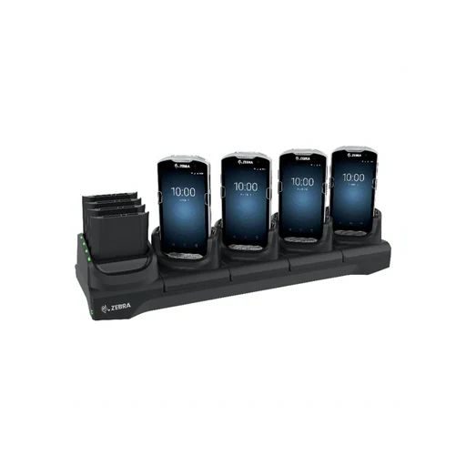
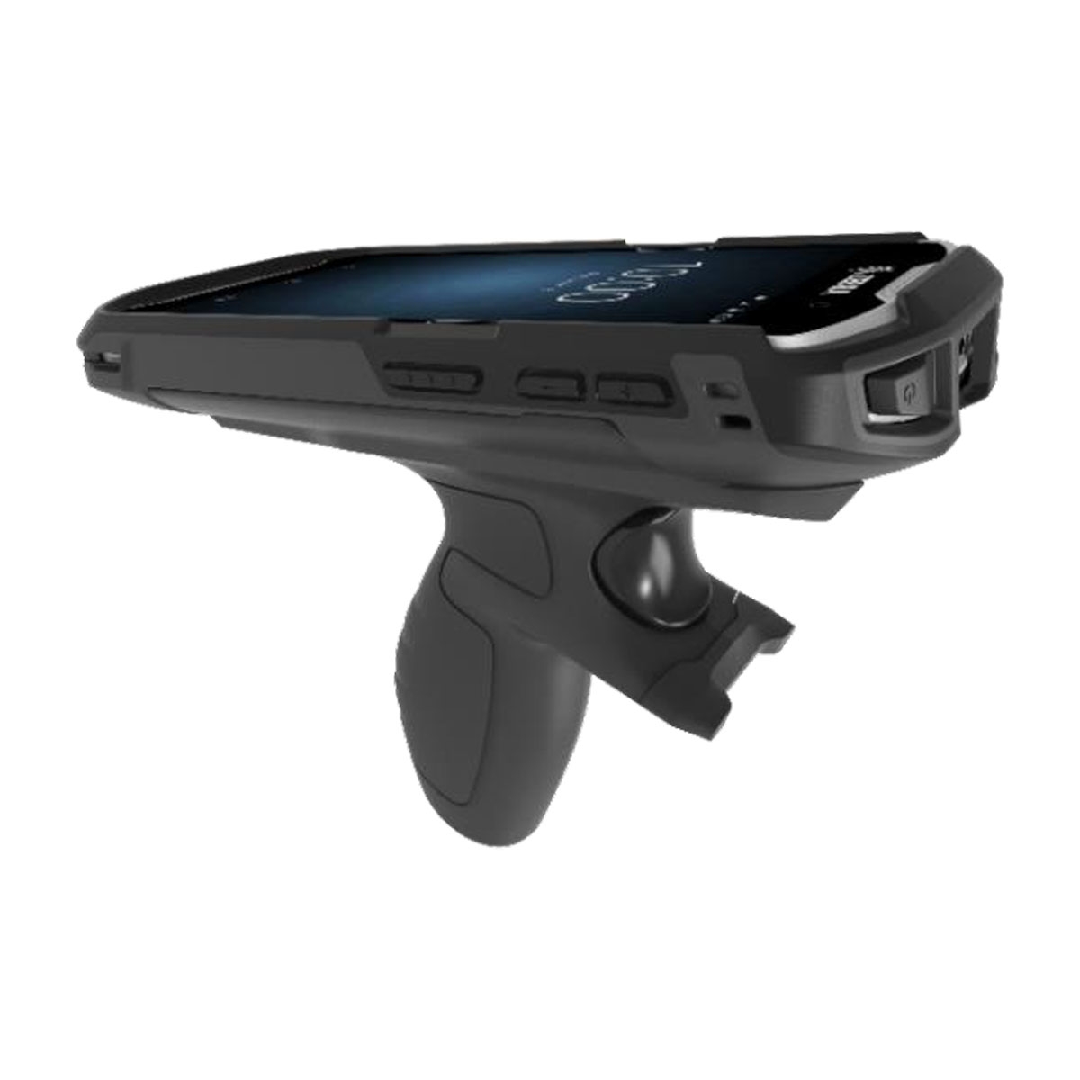
Ergonomic constraint: associates simultaneously held merchandise, a security tag, and the device. Every interface decision accounted for this.
Process artifact
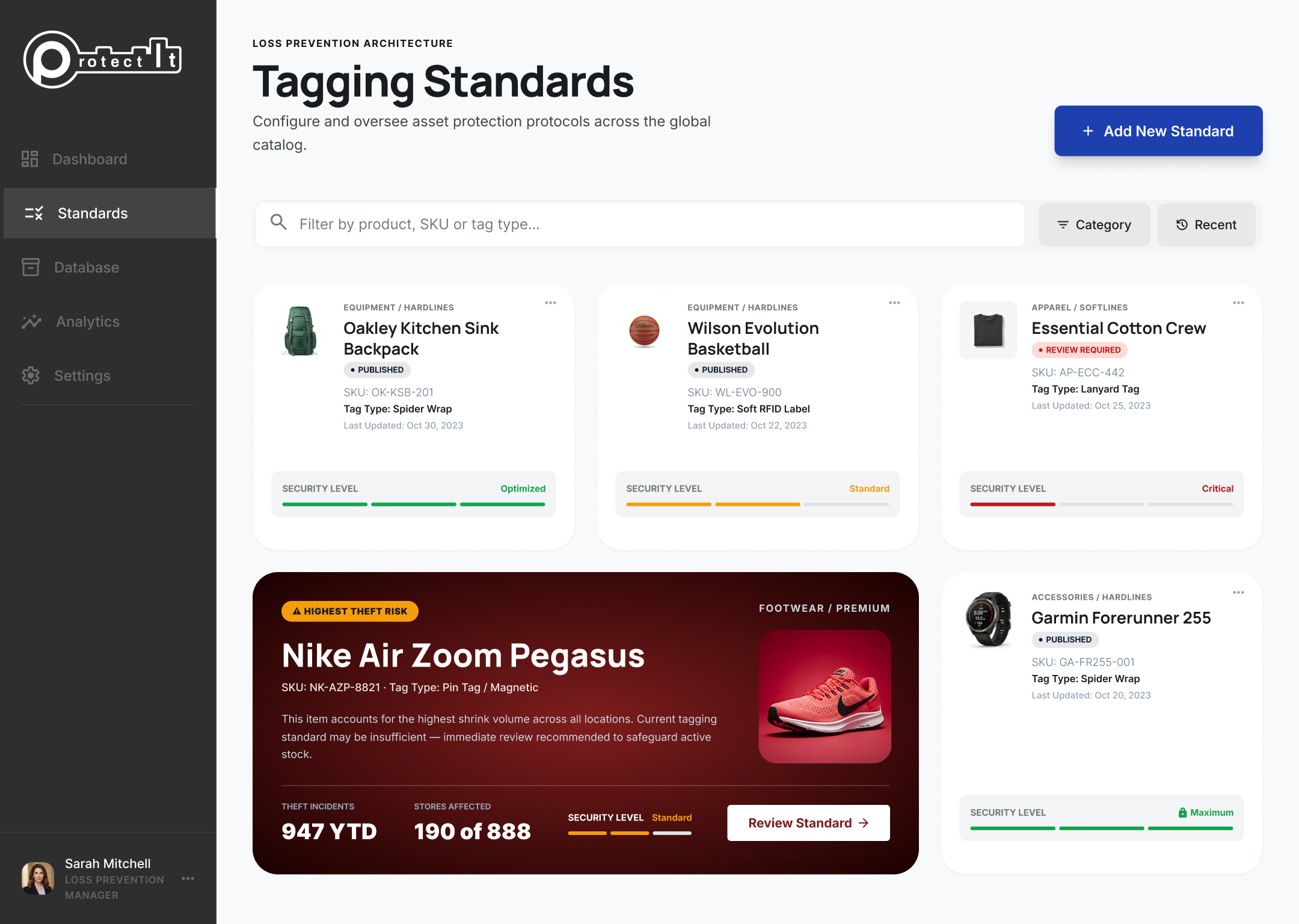
Wireframe — Standards Dashboard
Low-fidelity wireframe of the corporate Protect It portal, produced during the design phase to establish layout hierarchy before visual design began. Select any numbered callout to see the design rationale behind each decision.
Annotated low-fidelity wireframe of the Protect It Standards Dashboard, showing the corporate portal layout with seven interactive callout annotations.
Publish changes live to 812 store locations.
Last Updated: May 12, 2026 · Stores: 812/812
Last Updated: May 06, 2026 · Stores: —/812
Last Updated: Apr 28, 2026 · Stores: 812/812
Last Updated: Apr 22, 2026 · Stores: 812/812
Last Updated: Apr 18, 2026 · Stores: —/812
Last Updated: Apr 14, 2026 · Stores: 812/812
Repeated organized retail crime events flagged across 47 stores in the last 30 days. Current standard requires tier-3 review by LP Ops before next publish cycle (Fri 5/22).
Journey maps
I mapped every stakeholder's experience — before and after.
Each map traces the emotional arc from the moment a task begins to its resolution — showing exactly where the system failed people, and how Protect It changed that.
Store associate — warehouse & floor
Store manager
Corporate MES team
Customer
Path B — Looks for help. Every associate is in the back — chasing standards or waiting on manager.
System architecture
How the ecosystem works — before and after
Toggle between the fragmented before state and the connected after state. Select any node to see its role, pain points, and what changed.
Interactive before and after ecosystem diagram for the Protect It MES system. Toggle between the broken before state showing fragmented communication through email, binders, and a flashcard app, and the designed after state showing direct digital distribution through the Protect It platform.
to explore its role
Design Decisions
Simple by Necessity. Intentional by Design.
The TC52 device had real technical constraints: limited processing power, inconsistent WiFi, and employees who needed to simultaneously hold merchandise, a security tag, and a device. Every design decision was shaped by these realities.
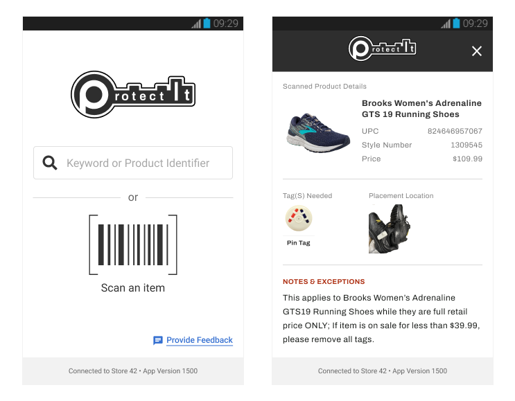
Shipped to engineering
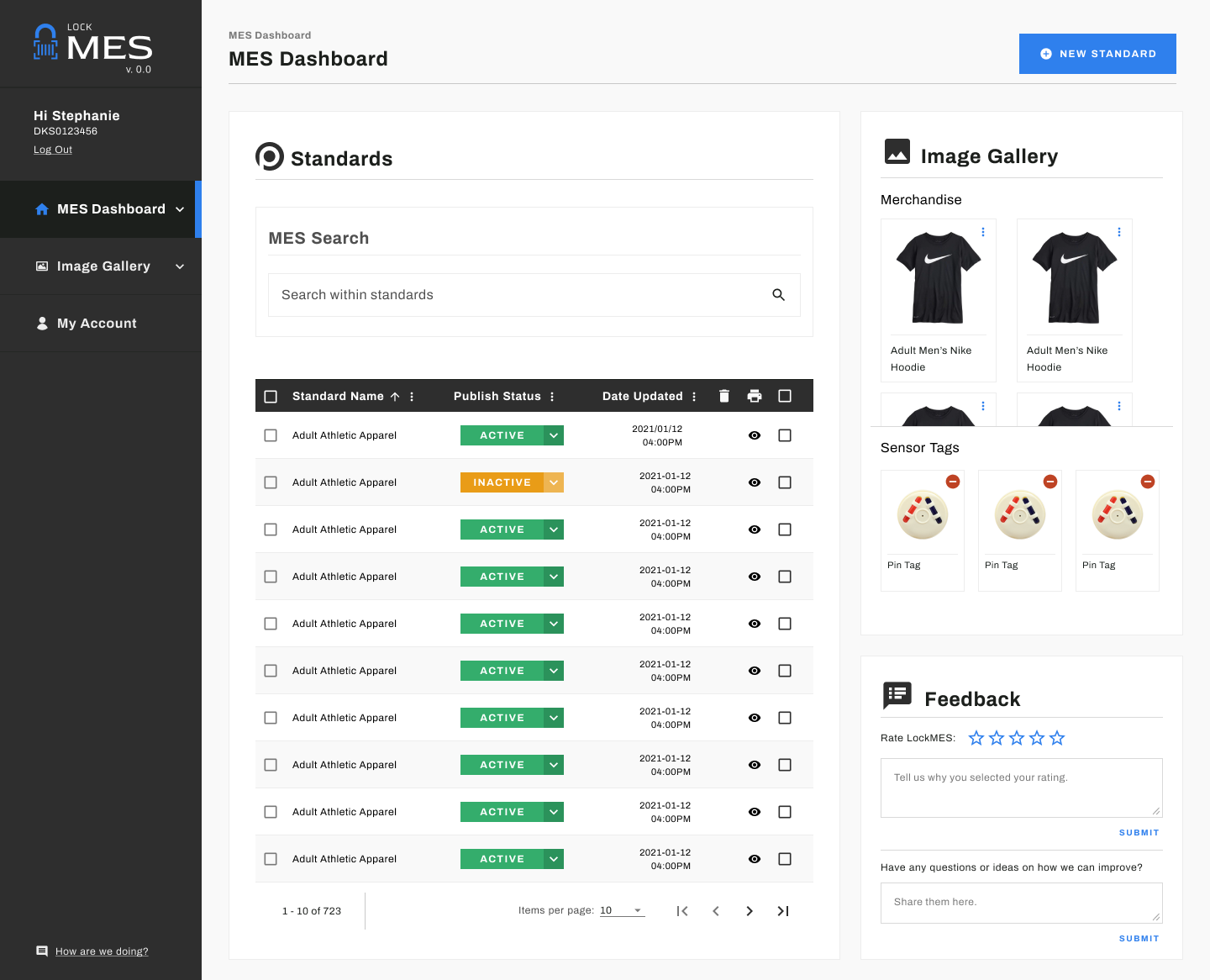
Reimagined today
Branding
From LockMES to Protect It
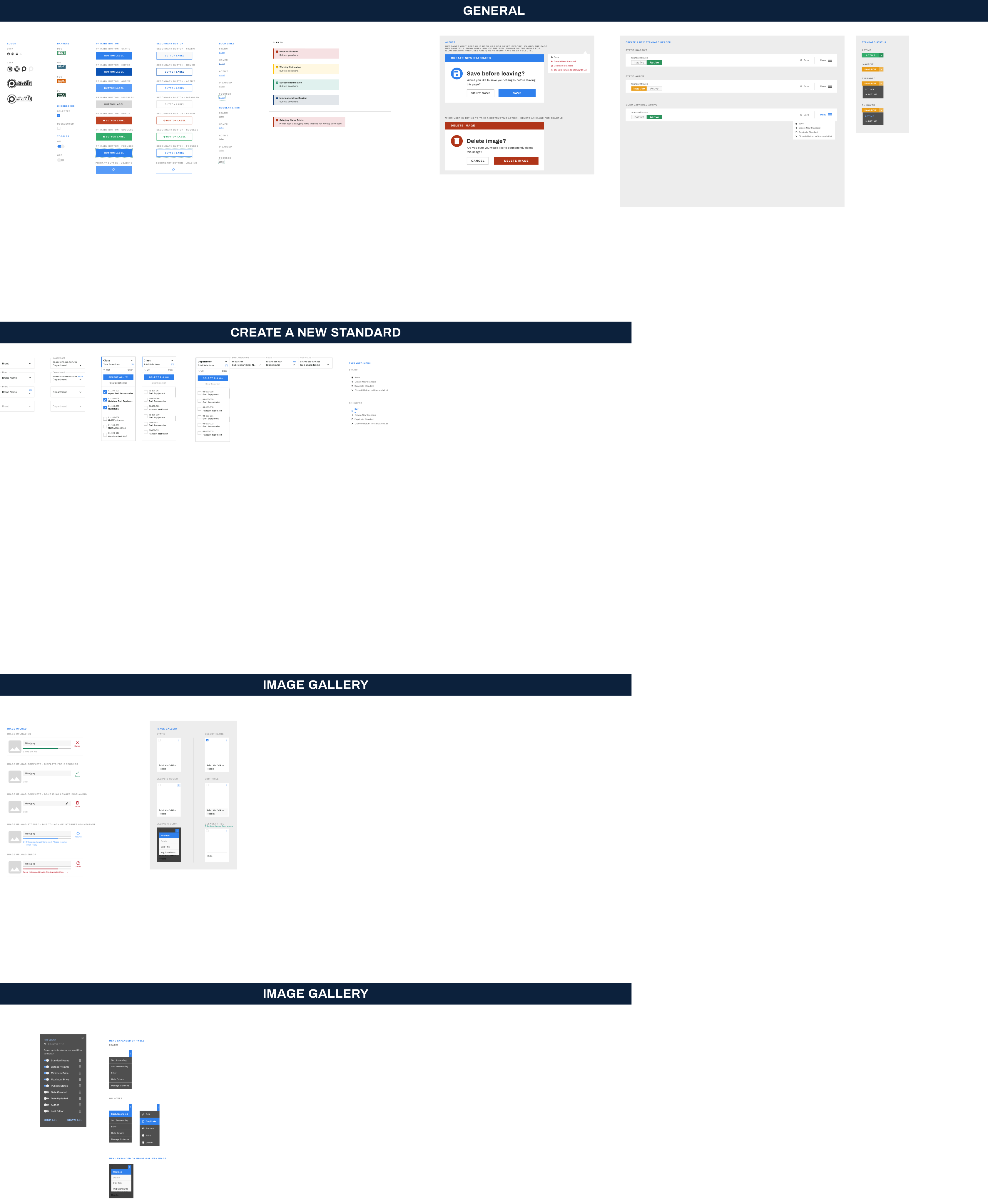
I developed the initial brand identity — "LockMES" — combining a lock icon, a scanner illustration, and a trust-building blue palette. After stakeholder feedback indicated a preference for a simpler, more authoritative feel, I redesigned the brand entirely.
The final identity — "Protect It" — used black as its dominant color with a key motif, projecting security and control. I ensured the name was distinctive enough to be found easily among the many apps on employee devices.
Outcomes
A Binder That Never Goes Out of Date
The "Protect It" SaaS solution replaced the physical MES binder system entirely. Store employees could scan a product and receive accurate, current tagging guidance in seconds. Corporate could push updates to every store simultaneously. The manager bottleneck was eliminated.
What I Learned
Enterprise UX Is a Systems Problem
This project taught me that enterprise UX isn't just about the interface — it's about the entire system of people, processes, and tools that the interface sits inside.
Designing the employee-facing app was only half the work. The corporate portal, the update workflow, the device constraints, the stakeholder alignment — all of it was the design. The binder wasn't a bad tool. It was a symptom of a system that had never been intentionally designed. That's what I replaced.
"Replacing a binder sounds small. But the binder was how 726 stores got their instructions, and it hadn't changed in years. The real design challenge wasn't the interface. It was earning the trust of people who had learned to work around a broken system. Good design has to be better than the workaround."
— Stephanie Gross, Lead UX Designer